至翔NID实景作品 | 小确幸
摘要:住宅不应是空间的退化,而是空间中的生活,与空间保持开放的关系。从打开门的那一刻便是享受小确幸的开始。
至翔 NID 空 间 设 计
ZX NID space design
Hard installation design
/
Soft installation design

感谢您关注至翔NID空间设计
Thank you for your attention to ZX NID design
Hard installation design & soft installation design
ZX NID design team
Changshu,Suzhou,China
2023

项目名称 | Name :小确幸
项目坐标 | Address :苏州 .常熟万科公望花园
项目风格 | Style :现代侘寂
设计机构 | Design :至翔NID空间设计
施工单位 | Consturuction :至翔精筑
设计时间 | Design time :2022·3
拍摄时间 | Shooting time :2022·9
项目面积 | Area :138㎡

至翔NID空间设计
住宅不应是空间的退化,
而是空间中的生活,
与空间保持开放的关系。
从打开门的那一刻便是享受小确幸的开始。

「 Design & Appeal | 设计&诉求 」
在虞城有这样一户房子,看得到美景的大横厅,让视野无限延展,窗外的景色如同一幅随时间变幻的油画,每天都有如此 “宝贵”的美景。
一推开家门,就仿佛来到了城市以外,家是惬意的静谧小屋,收下你所有的疲惫......在“温柔”这个调性,找到纯粹,去充实它,丰富它。
本案屋主是一对90后新婚夫妻,对于家的设想是简约不失浪漫。这套案子原房是精装房状态,房屋的装修风格已经过时了。不符合年轻人的审美,就决定让它蜕变一下:在没有破坏整体格局上,而是做了墙面顶面的设计处理,加上布局的局改 软装的搭配 诸多细节上的完善。希望能创建一个令人心安的庇护所,一处能给人抚慰和舒适感的个人领地。
「 Family changes | 户型改造 」

原始结构图

平面布置图
改造点:
1. 精装房风格太传统。
2. 阳台与客厅之间有移门,空间不够通透。
3. 收纳空间少。
改动:
1. 在不动整体格局的情况下改变风格。
2. 拆除阳台移门贯通阳台空间。
3. 北面小房间移门拆除,墙体重新规划。
01.
The sitting room
Design agency: Zhi Xiang NID space design
客厅


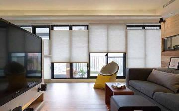
客厅由简单而连续的体块组成,原木色的电视柜,配合大面积的留白,精而简的设计手法将空间处理的很高级。
The living room is composed of simple and continuous blocks, the original wood color TV cabinet, with a large area of white space, fine and simple design techniques will process the space is very advanced.


客厅的视野非常开阔,以简单的白色乳胶漆为基调,再用木色做点缀,突显出极简的格调。打开阳台,大落地窗赋予空间明亮通透的环境,在家也能感受到阳光的温暖。
柔软的云朵沙发,搭配咖色的抱枕盖毯,躺在里面看书休息,内心也变得安静柔软。
The view of the living room is very wide, with simple white latex paint as the keynote, and then decorated with wood color, highlighting the minimalist style. Open the balcony, the large French Windows give the space a bright and transparent environment, at home can also feel the warmth of the sun.
Soft cloud sofa, with coffee - colored pillow cover blanket, lying inside reading rest, the heart has become quiet and soft.


整排的柜子直通到阳台,根据区域划分了不同的功能,客厅区域用作餐边柜,不仅宽敞的操作台面,还有强大的储藏空间。阳台部分做了通顶的收纳柜,很好的将洗衣机烘干机包裹起来,让阳台看起来整洁明亮。
The whole row of cabinets leads to the balcony, which is divided into different functions according to the area. The living room area is used as the side cabinet, which not only has a spacious operating table, but also has a powerful storage space. The balcony part is made into a storage cabinet through the top, which is good to wrap the washer and dryer, so that the balcony looks clean and bright.
02.
Restaurant
Design agency: Zhi Xiang NID space design
餐厅


餐厅邻近玄关,入户后映入眼帘的便是餐厅,客餐厅融合的布局使得整个用餐空间非常的明亮开阔。原木的餐桌上方悬挂着两个精致的吊灯,配上柔软的布艺座椅,一天的疲惫瞬间治愈。
The restaurant adjacent to the porch, after entering the door is greeted by the restaurant, the layout of customer restaurant integration makes the whole dining space is very bright and open. Two delicate chandeliers hang above the log dining table, with soft cloth seating, to heal the day's fatigue in an instant.


餐桌吧台紧挨着沙发,两者相互独立,又相互给与安全感,无形间为客厅与厨房的转移进行自然地过度分区。
The table bar is next to the sofa, which is independent of each other and gives each other a sense of security. The invisible space is naturally over-divided for the transfer of the living room and the kitchen.
03.
Kitchen
Design agency: Zhi Xiang NID space design
厨房

柜门更换成浅色,并重新规划了功能布局,右侧柜子拆除换成洗碗机,增强了厨房的使用体验,厨房的视觉效果也更加明亮宽敞。
The cabinet door was changed into a light color, and the functional layout was replanned. The right cabinet was removed and replaced with a dishwasher, which enhanced the use experience of the kitchen and made the visual effect of the kitchen more bright and spacious.
04.
Master bedroom
Design agency: Zhi Xiang NID space design
主卧室


主卧选择色彩温馨的奶白色系,软包靠背的床,倚靠起来舒适柔软,奶白色的床头柜简单的装饰一下,使得整个睡眠环境优雅温馨且浪漫。
The master bedroom chooses warm milky white color, soft bag back bed, lean comfortable and soft, milk white nightstand simple decoration, making the whole sleeping environment elegant, warm and romantic.
05.
cloakroom
Design agency: Zhi Xiang NID space design
衣帽间

衣帽间两边都设计了柜子,储藏功能强大,靠窗预留了折叠沙发床的位置,整个空间的功能强大又灵活。
The cloakroom is designed on both sides of the cabinet, the storage function is powerful, and the folding sofa bed is reserved by the window, the whole space is powerful and flexible.
Secondary bedroom
Design agency: Zhi Xiang NID space design
次卧室


次卧室选用木质的地板搭配暖白的墙面,整个空间明亮又不失温度,给人提供了一个温柔舒心的休息环境。
The second bedroom chooses the wooden floor with the warm white wall, the whole space is bright and does not lose the temperature, providing a gentle and comfortable rest environment.
07.
Toilet
Design agency: Zhi Xiang NID space design
卫生间

外卫干区更换了门框,墙面贴了瓷砖,干净整洁,与整体的风格相协调。
Outside the trunk area of the replacement of the door frame, wall tiles, clean and neat, and the overall style of coordination.


-至翔NID空间设计-
E N D


版权声明
本文均为至翔NID原创,请勿盗用
如需转载本文或商业合作,请邮件联系:1219449110@qq.com
如果您喜欢【至翔NID空间设计】
可以“推送”或“分享”给身边的朋友
标签:
热门资讯排行
- 资讯专区
- 图片专区
- 品牌专区


