至翔NID新作预告|揉光
摘要:家之所以独特,在于它是主人生活的容器,承载着不同个体的所思所想、所行所遇。 而人和家庭都是多面体,如同生活有不同切面,空间亦然。
至翔 NID 空 间 设 计
ZX NID space design
Hard installation design
/
Soft installation design

感谢您关注至翔NID空间设计
Thank you for your attention to ZX NID design
Hard installation design & soft installation design
ZX NID design team
Changshu,Suzhou,China
2024

项目名称 | Name :揉光
项目坐标 | Address :苏州 .常熟琥珀澜庭
项目风格 | Style :现代奶油
设计机构 | Design :至翔NID空间设计
项目面积 | Area :111㎡

至翔NID空间设计
家之所以独特,
在于它是主人生活的容器,
承载着不同个体的所思所想、所行所遇。
而人和家庭都是多面体,
如同生活有不同切面,空间亦然。

「 Design & Appeal | 设计&诉求 」
本案屋主小姐姐是美术老师,基于同是“艺术人”跨界交流灵感对话。无论是在平面开放式格局的规划上,还是整屋色彩的感知,都能提出非常丰满建议以及大胆接受,功能与美感的双重需求对话,实现家居空间的务实与理想化。
「 Family changes | 户型改造 」
改造点:
1.原先厨房空间不大,储物空间有限。
2.客厅阳台有移门分割不够通透。
3.主卫空间狭小使用不便。
4.主卫门口对着主卧床铺位置,收纳空间布局不合理。
5.南面次卧室有移门分割不够通透。
改动:
1.厨房墙体拆除,增加岛台将餐厅与厨房容纳一体。
2.打通南面阳台增大客厅公共空间的面积。
3.将南面阳台空间纳入次卧室室内做手工操作区。
4.将北面小房间作为衣帽间扩展主卧套房范围内。
5.将两个卫生间功能重新整合,归纳为一间大卫生间并增加浴缸泡澡。
01.
Foyer
Design agency: Zhi Xiang NID space design
玄关

入户进门被目光第一眼吸引是对面墙面上的手办区,如此微量调整带来不仅是感官上的变量,同时也是屋主小姐姐在设计之初就想要效果体现。在已知的家居架构下释放空间体积,入户门背后的鞋柜下方,做了小挑空内灯带设计,充盈门厅氛围感。左手分割柜面中层,镶绿色点缀,同时也是放置随手钥匙的功能,下面三层抽屉设计,满足日常生活中随手便捷的功能收纳需求。柔软亲肤的材质换鞋凳,搭配粉色洞洞板,家居功能形态于视感、体感、氛围感上共融共叙。
The first thing that catches the eye when entering the house is the handmade area on the opposite wall. Such slight adjustments not only bring sensory variables, but also reflect the effect that the homeowner lady wanted at the beginning of the design. Under the known home architecture, the space volume is released, and a small hanging interior light strip design is made below the shoe cabinet behind the entrance door, filling the atmosphere of the foyer. The left hand divides the middle layer of the cabinet surface, embellished with green, and also serves as a function for storing keys at hand. The bottom three layer drawer design meets the convenient storage needs of daily life. The soft and skin friendly material shoe changing stool, paired with pink perforated boards, blends and narrates the functional form of the home in terms of visual, physical, and atmosphere.
02.
The sitting room
Design agency: Zhi Xiang NID space design
客厅

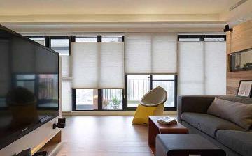
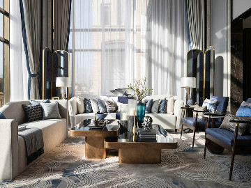
光影是情绪的舵手,承载着时光的流转。客厅大面积的落地窗让自然尽情洒落,在室内扮演着温情的调和者,将空间的纵深和明暗娓娓道来。富有舒缓轻柔暖白色,在空间形式表达和情绪塑造上,都为公区空间增加开阔、明朗、拥有不被束缚的表现力,让业主喜欢的风格更具独特性。
Light and shadow are the helmsmen of emotions, carrying the flow of time. The large-area french window let the nature freely sprinkle and fall, acting as a warm mediator indoors, telling the depth and light and darkness of the space. Rich and soothing, soft and warm white color, in terms of spatial expression and emotional shaping, it adds openness, clarity, and unrestricted expressive power to the public area space, making the style that homeowners like more unique.


天花采用椭圆形吊顶,与整体空间设计非常契合,拉升客厅空间感,设计的弧形吊顶从过道开始延伸至阳台,视觉上非常宽阔,也不压层高,没有压抑的感觉。沙发背面储物柜的设计,增加了客厅公区的功能性,屋主小姐姐可以尽情的买买买了~
The ceiling adopts an oval shaped ceiling, which is very in line with the overall space design, enhancing the sense of living room space. The designed curved ceiling extends from the aisle to the balcony, visually very wide, and does not press down on the floor height, without any sense of oppression. The design of the storage cabinet on the back of the sofa has increased the functionality of the living room public area, allowing homeowners to freely buy and sell~


玄关及客厅空间的吊顶皆采用圆弧设计元素,增添空间气质的柔和,圆弧空调柜面板、主灯、茶几等众多物件在形体上与之有效呼应。沙发采用可随时调整位置的块面形体,用简洁尺度,有效的设计语言所展现的功能规划,保有家居生活的随性、松弛感。主岛台的柜面与软装的选择配置上,色系材质一致,展现心神的怡然自得,生活的真实与富足。
The suspended ceilings of the foyer and living room spaces are all designed with curved elements, adding a soft and elegant atmosphere to the space. The curved air conditioning cabinet panels, main lights, coffee tables, and many other objects effectively echo them in form. The sofa adopts a block surface shape that can be adjusted at any time, showcasing functional planning with concise scale and effective design language, maintaining the casualness and relaxation of home life. In terms of the selection and configuration of the cabinet and soft furnishings on the main island, the color scheme and material are consistent, showcasing the contentment of the mind and the authenticity and richness of life.
03.
Kitchen area
Design agency: Zhi Xiang NID space design
餐厨区

这里,是家人欢聚的场所,也是朋友相聚的天地。厨房、餐厅仅用一座岛台就能满足日常生活所需。悬挑的设计,减轻整个岛台的厚重感,赋予空间轻盈的感知。宽阔的台面、复合的功能、大理石简约高级的质感,可完美适应就餐、烹饪、下午茶等任何场景,提升了空间的利用率,让小家也拥有足够的仪式感。
This is a place for family gatherings and also a place for friends to gather. A kitchen and restaurant can meet daily needs with just one island platform. The overhanging design reduces the heaviness of the entire island platform and gives the space a sense of lightness. The spacious countertop, composite functions, and simple and high-end texture of marble can perfectly adapt to any scene such as dining, cooking, afternoon tea, etc., improving the utilization of space and giving small homes enough sense of ceremony.
04.
Master bedroom
Design agency: Zhi Xiang NID space design
主卧室

延续客餐厅色调,以清浅柔和的氛围重构睡眠空间,地面材质延续大块面瓷砖铺贴,方便打理,顶面和背景圆弧造型与公区细节呼应,素雅简洁的手法,落笔勾勒家居生活的浪漫与从容。
Continuing the color tone of the dining room, the sleeping space is reconstructed with a light and soft atmosphere. The floor material continues to be paved with large ceramic tiles, making it easy to maintain. The curved shape of the top and background echoes the details of the public area. With elegant and simple techniques, the writing outlines the romance and calmness of home life.

梳妆台利用飘台上一角,得到了使用空间长度延伸,台面用了部分玻璃做面板既是梳妆台面,抽屉下也能放首饰或者藏品。剩余飘窗空间,中间定制黑色橡木小茶台,两边柔软坐垫相衬,屋主日常在家看书或与闺蜜朋友在卧室小坐,氛围和乐融融,与茶香书卷相伴,光影随时与空间相映成趣,一切状态是自由的、舒适的。
The dressing table utilizes a corner of the floating table to extend the length of the usage space. The countertop is made of some glass panels, which serve as a dressing table and can also hold jewelry or collectibles under the drawers. The remaining bay window space is custom-made with a black oak small tea table in the middle, complemented by soft cushions on both sides. The homeowner reads books at home or sits with friends in the bedroom, creating a harmonious atmosphere accompanied by tea and books. Light and shadow complement the space at any time, and everything is free and comfortable.

把原先主卫墙体拆除打通后,设计衣帽间跟书房,既扩大了主卧面积又实现了南北通透的双向丰沛采光。定制黑色橡木书桌穿插衣柜侧面延伸卧室空间感,配彩色几何线条单椅,简洁可爱。
After demolishing and connecting the original main bathroom wall, a wardrobe and study room were designed, which not only expanded the area of the master bedroom but also achieved two-way and abundant lighting with north-south transparency. Customized black oak desk interspersed with wardrobe side to extend the sense of bedroom space, paired with colorful geometric lines of single chairs, simple and cute.

整个空间像一帧长镜头,从天花板到墙体,统一用乳胶漆,隔而不断的关系让不同功能分区若隐若现。在这个构图中,线条与功能圆弧形角度打开,从主卧室至衣帽间勾勒出一个开放、惬意随性的空间。
The entire space is like a long shot, from the ceiling to the walls, uniformly painted with latex paint, and the continuous relationship between them makes different functional zones appear faintly. In this composition, the lines and functional arcs open at an angle, outlining an open, comfortable and casual space from the master bedroom to the cloakroom.

整合空间以达到生活的舒适最大化,隔墙打通,将北面次卧纳入主卧套间,作为步入式衣帽间所用,并随之调整房门位置,主卧到衣帽间到卫生间形成一组回游动线。使动线与功能布局更加合理高效,扩容空间体积,将面积统筹高效利用,提升使用舒适度。
Integrate space to achieve maximum comfort in daily life, connect the partition walls, and incorporate the north side secondary bedroom into the master bedroom suite as a walk-in closet. Adjust the door position accordingly, forming a loop from the master bedroom to the closet to the bathroom. Make the distribution and functional layout more reasonable and efficient, expand the space volume, coordinate and efficiently utilize the area, and improve the comfort of use.
05.
Secondary recumbent
Design agency: Zhi Xiang NID space design
次卧

次卧将南面阳台扩到卧室空间,作为屋主小姐姐日常的“手作工作室”。墙顶刷乳胶漆,空间以典雅柔美的奶油色为主调,大靠背双人床、奶白色单椅,呈现松弛且愉悦的氛围体验。
The second bedroom expands the south balcony to the bedroom space, serving as the daily "handicraft studio" for the homeowner's younger sister. The wall top is painted with latex paint, and the space is dominated by an elegant and soft cream color. The large backrest double bed and milk white single chair present a relaxed and enjoyable atmosphere experience.
标签:
热门资讯排行
- 资讯专区
- 图片专区
- 品牌专区


