至翔NID实景作品 | 翛然
摘要:生命最好的时光,除了忙碌,就是用来享受的。 舒缓、自然、惬意才是生活应有的样子。
至翔 NID 空 间 设 计
ZX NID space design
Hard installation design
/
Soft installation design

感谢您关注至翔NID空间设计
Thank you for your attention to ZX NID design
Hard installation design & soft installation design
ZX NID design team
Changshu,Suzhou,China
2023

项目名称 | Name :翛然
项目坐标 | Address :苏州 中骏·天荟
项目风格 | Style :北欧风情
设计机构 | Design :至翔NID空间设计
施工单位 | Consturuction :至翔精筑
设计时间 | Design time :2022·6
拍摄时间 | Shooting time :2023·3
项目面积 | Area :102㎡

至翔NID空间设计
生命最好的时光,除了忙碌,就是用来享受的。
舒缓、自然、惬意才是生活应有的样子。

「 Design & Appeal | 设计&诉求 」
本案是一位漂亮的海归小姐姐家。在国外留学时喜欢国外家居的松弛氛围感。去年学成回国后,通过朋友找到我们的设计团队。因为这套案子原房是精装房状态,房屋的装修风格真的不喜欢。也不符合年轻人的审美,决定让它蜕变一下。没有破坏整体格局上是做色调和软配的设计处理,适当布局的调整 合理的软装搭配,诸多细节上的完善。创建一个令人心安的庇护所,一处能给人抚慰和舒适感的个人领地。
全屋色彩:
墙面以大面积浅色为主色调,奶油色增加空间层次和温度;地板全屋胡桃木地板通铺,家具选择北欧风情打底,浅色石材纹茶几,搭配棉麻材质沙发与木质辅以点缀,全屋的松弛氛围感就出来了~
改造开始:
“真正的生活总是在他方。“为营造简约明亮的视觉,选择以米灰色调与木质交织,墙面多个拱形窗让室内明亮大气,消弭了室内沉重的量感,使空间更加柔和温润,让空间感得到无限的延伸。
「 Family changes | 户型改造 」
 原始结构图
原始结构图

平面布置图
改造点:
1. 原有精装设计整体色调太过深沉。
2. 原始电视背景不符合当下的审美。
3. 整体太规整没有设计点。
4. 卫生间空间偏小。
改动:
1.全屋色调调整,墙面做造型,米色墙面乳胶漆。
2.电视背景拆除,直接留白搭配北欧实木家具。
3.整体空间调整,卧室融合北次卧做了主卧套房,空间收纳增加。
4.改变内卫格局做了三分离设计,拥有独立泡澡浴缸。
01.
The sitting room
Design agency: Zhi Xiang NID space design


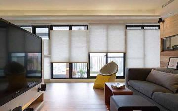
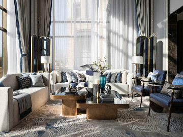
过道墙体做了拱门造型增加了整个过道的空间感和开放性,米黄色的墙面晕染了原本的吊顶,使其不显得那么突兀,与整体软装相协调,营造了一种温馨舒适的氛围。棉麻材质沙发与木质结合,给人一种放松的感觉,搭配奶油色茶几和浅色地毯,装饰画和干花加入则增加整个客厅艺术气氛,空间更具有魅力和品味。
The wall of the aisle is made of arch shape to increase the sense of space and openness of the whole aisle. The beige wall is stained with the original suspended ceiling, making it not so abrupt, and coordinating with the overall soft installation, creating a warm and comfortable atmosphere. The combination of cotton and linen sofa and wood gives people a relaxed feeling, with cream coffee table and light carpet, decorative paintings and dried flowers add to the entire living room artistic atmosphere, the space has more charm and taste.


实木电视柜的自然纹理与温暖质感,搭配上花瓶和绿植可以为空间增添生机和自然气息,而装饰画则为空间增加了艺术感,镂空造型的落地灯不仅给空间提供了照明,同时也是一个不错的装饰品。整个空间色彩的搭配和材质的运用恰到好处,让整个空间舒适、和谐。
The natural texture and warm texture of the solid wood TV cabinet, paired with vases and green plants, can add vitality and natural breath to the space, while the decorative painting adds a sense of art to the space, the hollow-shaped floor lamp not only provides lighting for the space, but also a good decoration. The collocation of colors and the use of materials in the whole space are just right, making the whole space comfortable and harmonious.
02.
Restaurant
Design agency: Zhi Xiang NID space design
餐厅


原有鞋柜木饰色调太重,做了拱形设计,开放壁龛柜收纳物品的同时兼具了展示的功能,悬浮餐边柜的设计,方便打扫卫生,柜体的木色与浅灰的碰撞,胡桃木地板与墙面色调的对比,揉合了色彩,增加了空间的层次。蛋壳吊灯和几何形的餐桌搭配,在颜色和形态上形成对比,使空间更具时尚感。
The color of the original shoe cabinet is too heavy, so the arch design is made, and the open niche cabinet has the function of display while storing items. The design of the suspended dining cabinet is convenient for cleaning. The collision of wood color and light gray of the cabinet body and the contrast of walnut wood floor and wall tone combine colors and increase the level of space. The eggshell chandelier and the geometric dining table match to create a contrast in color and form, making the space more fashionable.
03.
Kitchen
Design agency: Zhi Xiang NID space design
厨房

厨房内部未做改动,但原来的橱柜与风格搭配协调自然,在的基础上增设了电器柜,完善了功能,使用起来更加顺手方便。
The interior of the kitchen has not been changed, but the original cabinet is coordinated and natural with the style, and the electrical cabinet is added on the basis of it, which improves the function and is more convenient to use.
04.
Master bedroom
Design agency: Zhi Xiang NID space design
主卧


主卧室由于做了套房,休息的空间只放置了一个斗柜作为日常放置衣物使用,柔软的床搭配暖洋洋的床品,营造了温馨舒适的休息氛围,床边小吊灯与两个各具特色的床头柜,个性又有时尚感。月球灯随意地摆放在地上,柔和的灯光升华了温馨的氛围。个性的宝石灯,通过独特的设计,将宝石的元素融入到灯具上,使灯光变得迷人又有魅力,彰显了居住者的个性,给空间增添了一份独特的艺术氛围。
As the master bedroom is made into a suite, only a cabinet is placed in the rest space as a daily placement of clothes, soft bed with warm bedding, creating a warm and comfortable rest atmosphere, bedside chandelier and two unique bedside tables, personality and fashion sense. The moon lamp is randomly placed on the ground, and the soft light sublimates the warm atmosphere. Personality of the gem lamp, through the unique design, the gem elements into the lamp, so that the light becomes charming and charming, highlighting the personality of the occupants, to the space adds a unique artistic atmosphere.
05.
Cloakroom
Design agency: Zhi Xiang NID space design
衣帽间

衣帽间定做了整排的储物柜,靠窗设计了开放格搭配上梳妆台,整个空间的功能十分的强大,布艺的座椅,借着窗帘透过的光,整个空间温馨又舒适。
The cloakroom customized the whole row of lockers, the window design of the open grid with the dresser, the function of the whole space is very powerful, cloth seats, through the light through the curtain, the whole space is warm and comfortable.
06.
Main interior guard
Design agency: Zhi Xiang NID space design
主内卫


主内卫的扩大是整个设计的亮点,卫生间做了三分离设计,悬空的双台盆使用起来宽敞又舒适,同时也很方便打扫。黑色的台面与整体的奶白色作对比,丰富了空间的层次,卫生间的功能性与实用性得到了大大的增强,同时让业主拥有了可以独立泡澡的浴缸。
The expansion of the main interior is the highlight of the whole design, the bathroom is made of three separate design, the suspended double basin is spacious and comfortable to use, but also easy to clean. The black countertop is contrasted with the overall milky white, enriching the level of space, greatly enhancing the functionality and practicality of the bathroom, and allowing the owner to have an independent bath tub.
07.
Study
Design agency: Zhi Xiang NID space design


多功能室的墙面和整体风格一样延用了奶白色,大幅的装饰画靠着墙面,另一面墙上则是浅灰色的置物架,与沙发地毯构造出一个舒适恬怡的休息空间,地毯与沙发的黑色打破了整个空间单调的配色,是整个空间活跃了起来。绿植的加入为空间增添了自然的气息。穿过多功能室外面便是洗衣晾晒区,不大的空间干净清爽,功能齐全。
The wall of the multi-functional room is the same as the overall style with milk white, large decorative paintings against the wall, the other wall is a light gray shelf, and the sofa carpet to create a comfortable and pleasant rest space, the black carpet and sofa break the monotonous color of the whole space, is the whole space active. The addition of green plants adds a natural atmosphere to the space. Through the multi-functional outdoor surface is the laundry and drying area, a small space clean and refreshing, functional.
08.
Balcony
Design agency: Zhi Xiang NID space design
阳台

洗烘组合的叠放最大程度利用空间,洗手池能方便我们洗涤的任务,其余空间则设计成储藏柜,收纳平时使用的清洁用品。海鸥风铃悬挂在晾衣杆上,为这个空间增加些许灵动和惬意的氛围,使原本就不大的阳台看起来既实用又舒适。
The combination of washing and drying is stacked to maximize the use of space, the sink can facilitate our washing tasks, and the rest of the space is designed as a storage cabinet for the usual use of cleaning supplies. The sea gull wind chimes hang from the clothes drying pole, adding a little flexibility and cozy atmosphere to the space, making the already small balcony look practical and comfortable.


1


-至翔NID空间设计-
E N D

标签:
热门资讯排行
- 资讯专区
- 图片专区
- 品牌专区


